LRC Website Refresh
My Role:
UX Designer
Internship Duration:
3 months
Case Introduction
The objective of this project's redesign was to enhance the user experience for students and faculty staff in their quest to efficiently find resources on the LRC website, ultimately facilitating their success. I was provided with a comprehensive user experience research report, which served as the foundation for this initiative.
My Responsibilities:
Analyze existing usability testing results and information architecture
Redesign the website to address identified user needs and pain points
Conduct usability testing for the revamped design
Refine and finalize the design based on user feedback
Design Constraint:
Restricted design layout/format with the LibGuide platform
(CSS and HTML are used as workarounds)
UX Report Analysis & Redesign
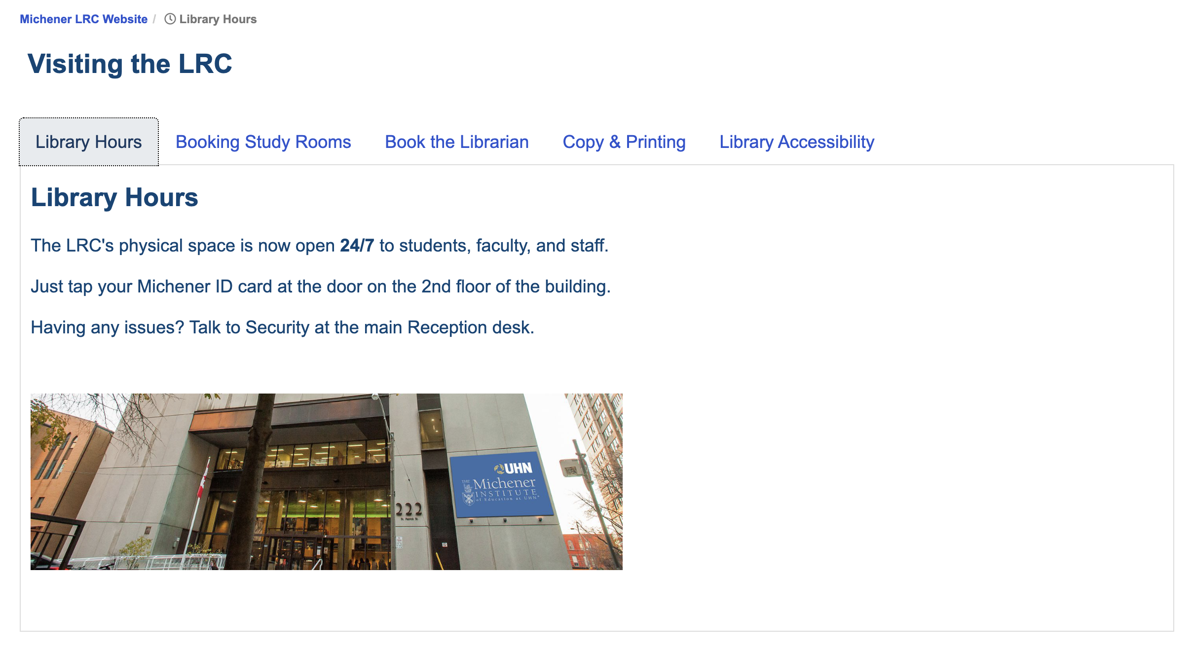
The UX report indicates that students are having trouble finding library-related information, such as library hours, booking study rooms, etc. As a result, the redesign has added a new section in the navigation bar and organized all visiting information together. This change aims to simplify students' access to library-related information.
IA- Navigation
Before
After
Section home page design matches system consistency
Tabbed box layout for easy & faster browsing between pages
The UX report indicated that students were having trouble navigating and searching for specific information on the home page. The report also noted that the current home page is overwhelming and contains too much information. Additionally, the auto carousel was found to be distracting. To address these issues, I have:
Relocated and reorganized the information to more relevant sections/pages on the website, only leaving necessary information
Simplified the background image for the search area to highlight the search function, which is the most crucial function on the site
Replaced the carousel with a still gallery layout to eliminate distractions
These changes were made to reduce users' cognitive load and improve the page's efficiency.
Information Layout 1/2
Before
After
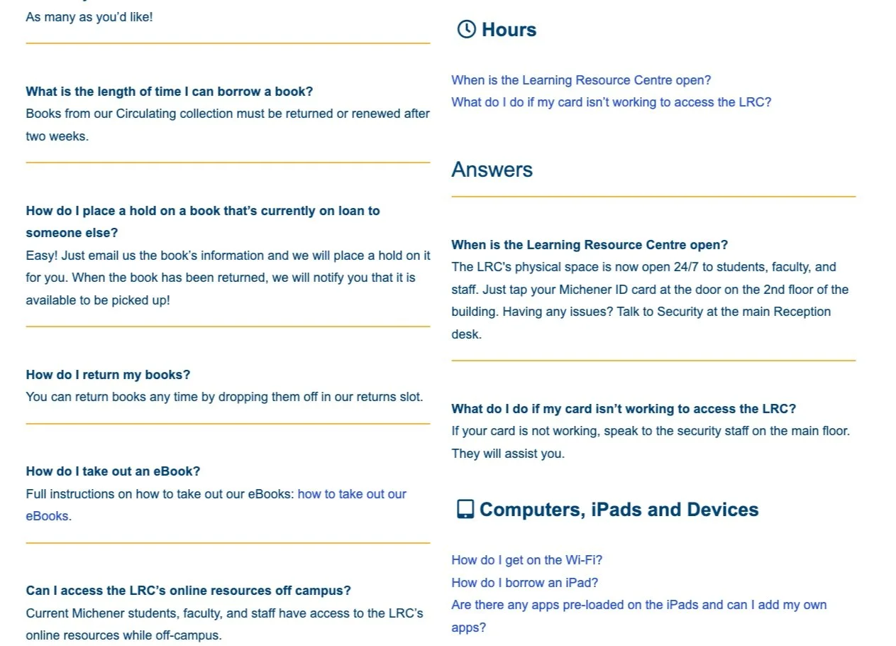
The FAQ page that uses the two-column anchor format has been reported as difficult to use by multiple students. The results of the usability testing conducted on this feature confirmed that a better format is needed. The current format does not fit well with the users' mental model, and as a result, it reduces the efficiency of using this page.
I replaced the previous format with a new single-column accordion format. This new format has a clearer division between question topics, making it easier for the user to quickly scan through the questions. The conventional format matches the user's mental model, which ultimately increases the page's efficiency.
Information Layout 2/2
Before
After
Usability Testing for Redesign
A 2-hour guerrilla test assigned by the client was conducted at the LRC library to verify the usability of the redesign. Four prioritized tasks were prepared for this 10-minute test. Seven students participated and verified that most of the redesign was validated by being able to find the requested information very quickly. The average success rate for all tasks was 85% (6 out of 7), which is much higher than the previous report with similar tasks.
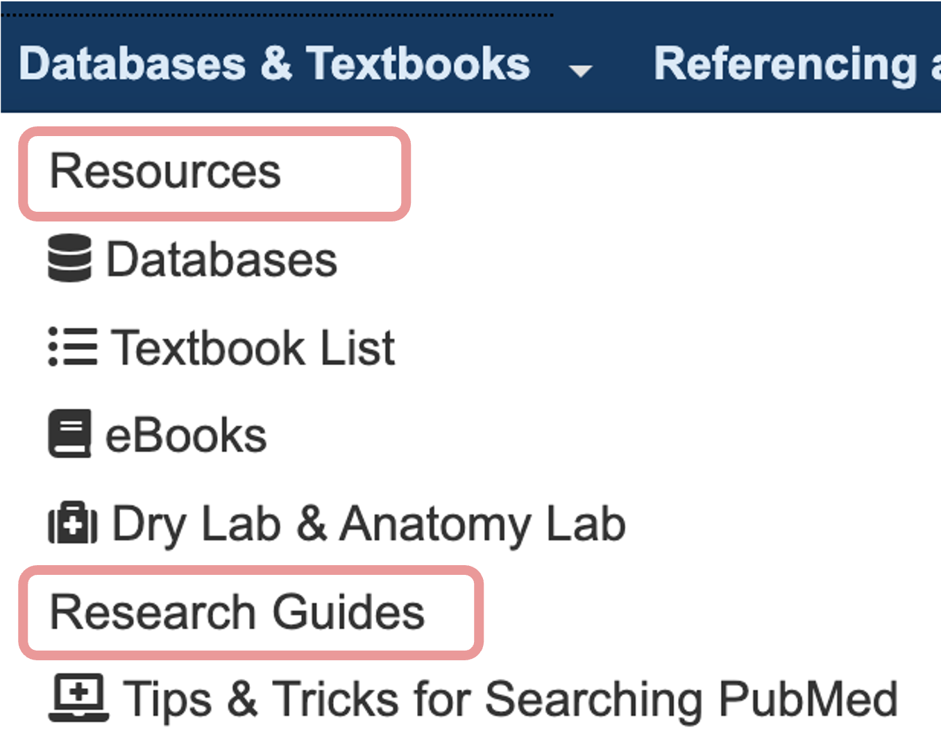
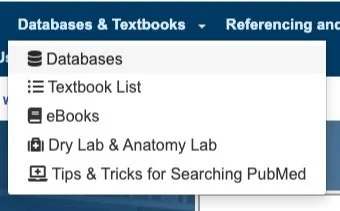
The subheadings were added based on the previous UX report to provide a clearer information architecture. However, based on the usability testing results, we found that people were more confused by the subheadings as they thought they were just page names without icons. Unfortunately, we could not change the format of the subheadings due to technical restrictions. Therefore, we have decided to remove the subheadings and leave the dropdown menu as is to avoid unnecessary confusion.
Before
After
Insights & Conclusion
During my experience conducting guerrilla testing, I came to the realization that user habits have a significant impact on the results of usability testing. Specifically, I found that frequent users of a website tend to stick to the features they are used to and ignore newly added features. If given the chance to redesign the test, I would create a task that focuses solely on the newly added feature to prevent users from missing the target due to their habitual use of the website. I believe that this adjustment would result in more accurate and representative data on the usability of the new feature.
My redesign was launched in September 2023 and is now being used by students. For the complete design, please visit the LRC website.


