University of Toronto
CLNx IA Redesign
(Career & Co-Curricular Learning Network)
Teammates:
IA Lecture Classmates
Duration:
12 weeks
My Role:
UI Design | User Flow Design | Prototyping
Design Intent
The CLNx website is one of the only resources the University of Toronto provides for students to find jobs either on campus, off campus, or work-study. We, as UofT students, would like to redesign the IA of the Recruitment and Careers section of the website and improve the CLNx Job seeking experience for UofT students.
Navigation Hierarchy Analysis
To ensure that the categorization of the website meets users' expectations, open card sorting was conducted using the current navigation system. The efficiency of a website heavily relies on its navigation, and this step will help us determine if any improvements need to be made.
Key Problems
Lots of confusion about the placement of "Job Search Overview" and "Organizational Profiles".
There is a notable gap due to the different ways in which participants name and group the cards compared to the current categorization.
Open Card Sorting Result
Refine Navigation & Conduct Evaluation
After analyzing the results of the open card sorting, it was clear that the navigation bar needed to be renamed and regrouped. The users' inputs were used for grouping and naming to create a new categorization, and it was tested with new participants in a closed card sorting exercise, including after-session questionnaires.
Findings
The updated categorization system was effective in reducing the majority of confusion. However, some participants still experienced confusion about the content/wording of the “Job Search Overview“ and the inconsistent labels (“Postings” vs “Jobs”).
Approach
So we removed the "Job Search Overview" page, as it duplicates information already on the Home page and unified the labels used in the sites.
Closed Card Sorting Result
User Workflows Analysis
After completing the navigation reorganization and relabeling, tree tests were used to test the main task flows to ensure that the crucial information was easily accessible.
Key Problems
The placement of the "Save" button and "My Saved Jobs" does not align with the user's expected layout.
Task 3 Result- “Find and Save a Volunteer Listing”
Task 4 Result - “Find the jobs that you looked at and will be applying to later (View Saved Listings)”

How can we simplify the process of students looking for jobs using CLNx?
Mental Model Match
Relocated some elements/features to match users’ mental models.
Efficientcy
Simplified and clarified the breadth and depth of information hierarchy to make the search process more efficient, requiring less clicks.
Proposal for Mobile Version
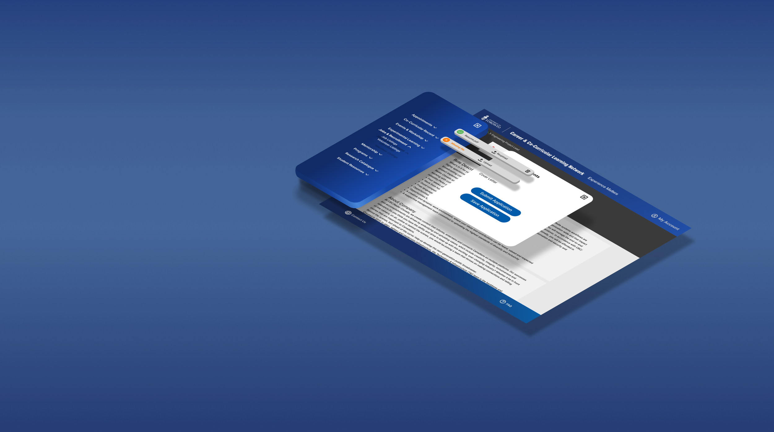
We proposed to enhance the mobile version of this website to create a user-friendly layout for students to easily browse and apply for jobs on their phones.
Redesign Approach
Redesigned Schematic Diagram
Wireframes of Redesigned Workflows
Simplified workflow for job applications based on the redesigned schematic diagram.
Workflow for Job Application (Desktop)
Workflow for Job Application (Mobile)
Team Challenge:
Tight Deadlines
Inefficient communication among our 8-member team presented a challenge, resulting in a tight deadline situation.
After the initial design phase, my design teammates and I actively sought feedback to refine our work. However, the absence of a set deadline for receiving feedback led to delays. As a consequence, we had limited time to finalize the design.
Strategic Approaches to Addressing Feedback and Deliverables:
To address the challenge of limited time, I took proactive steps to manage the workload and address the valuable feedback we received.
I communicated the workload situation to the team, explaining the constraints and the reason behind our inability to include all the feedback. This fostered understanding and set realistic expectations among team members.
Prioritizing essential changes based on user test results and team feedback, my teammates and I focused on resolving critical issues within the available timeframe.
In the final deliverable, we recommended a "Next Step" section to guide future designs, incorporating potential enhancements derived from feedback. This ensured that valuable insights could be effectively utilized in subsequent iterations.
Prototyping
Final Design for Mobile
Searching and Saving A Job
Our redesigned solution has received unanimous approval from our target users, who firmly believe that it surpasses the previous version in terms of usability and user-friendliness.
The Process of searching and saving a job
Utilizing Advanced Search
Categorized advanced search content and added Accordion Element to simplify the page layout.
The Process of utilizing advanced search
Explicit job listings on the main page instead of multiple steps to search for it.
Added saved marks on the listings page to avoid going back and forth between saved listings and the main page.
Redesign Achievement
Personal Growth & Reflection
From this project, I recognized the paramount importance of adopting a team-oriented mindset, particularly when one’s contributions relied on the collective efforts of the entire team.
Understanding the significance of smooth collaboration, I prioritized timely communication and established clear deadlines. By doing so, we not only ensure efficient task completion but also provide ample time for comprehensive reviews and enhancements.
Icon Reference: icons8.com


